Ryan Anderson | October 5, 2021
The Simpson's Paradox Edition
On stats, lies, and aggregate numbers
Ryan Anderson (RJA) is joining us for his sixth WITI, having previously written about everything from Video-Assisted Review to Semiconductors to The 4-Color Deck. He is a currently on-sabbatical marketing executive based in Atlanta, GA, and would love to talk to any interesting people about anything at any time.
Ryan here. Having spent a lot of my high school and college life in math classes, statistics, in particular, it was a little surprising to learn that not everyone has a favorite statistical paradox. There are lots of good ones to choose from, including the Friendship Paradox (most people have fewer friends than their friends do, on average) and the Will Rogers Phenomenon (familiarized by the comedian’s apocryphal quote on Oklahoma migrants, and more accurately described as moving one item from set A to set B causing both sets’ average to increase).
While both of those are nice, Simpson’s Paradox wins my admiration as my favorite statistical paradox. It’s simple to describe, yet it still stops me in my tracks when I see it in the wild. The paradox is that a measurable effect on a large population disappears, or even reverses when that population is split into subgroups. The cause of these results is almost always a material change in the denominators from one period to the next.
Showing is easier than telling with paradoxes, so here is a classic example: In 1995 and 1996, David Justice had a higher batting average than Derek Jeter in each year. However, Jeter had a higher cumulative batting average over those two years.

How does this work? Jeter’s 1996 stats accounted for over 92% of his total performance over the two years, as he was 20 years old and only called up to the major league for a few games in 1995. Meanwhile, Justice’s 1996 stats were only 25% of his total performance due to a separated shoulder he suffered barely two months into the season. So while Justice performed better on smaller sample size, Jeter’s 183 hits in 1996 were the strongest signal for overall performance.
Why is this interesting?
We’ve all heard the quote made famous by Mark Twain, but whose provenance is unknown, “There are three kinds of lies: lies, damned lies, and statistics." Statistical paradoxes are at the heart of this. Even experts who can explain how and why they happen will feel a tinge of discomfort when one rears its head.
And there are a number of critically important measures that can fall prey to a paradox.
For instance, imagine the average income for every working-age population goes up, but at the same time, overall average income falls as more Millenials move into their mid-career earnings peaks while Baby Boomers retire. Is that good or bad for the economy?
Or, especially poignant at this moment, what if Simpson’s Paradox confuses messaging around COVID vaccine efficacy?
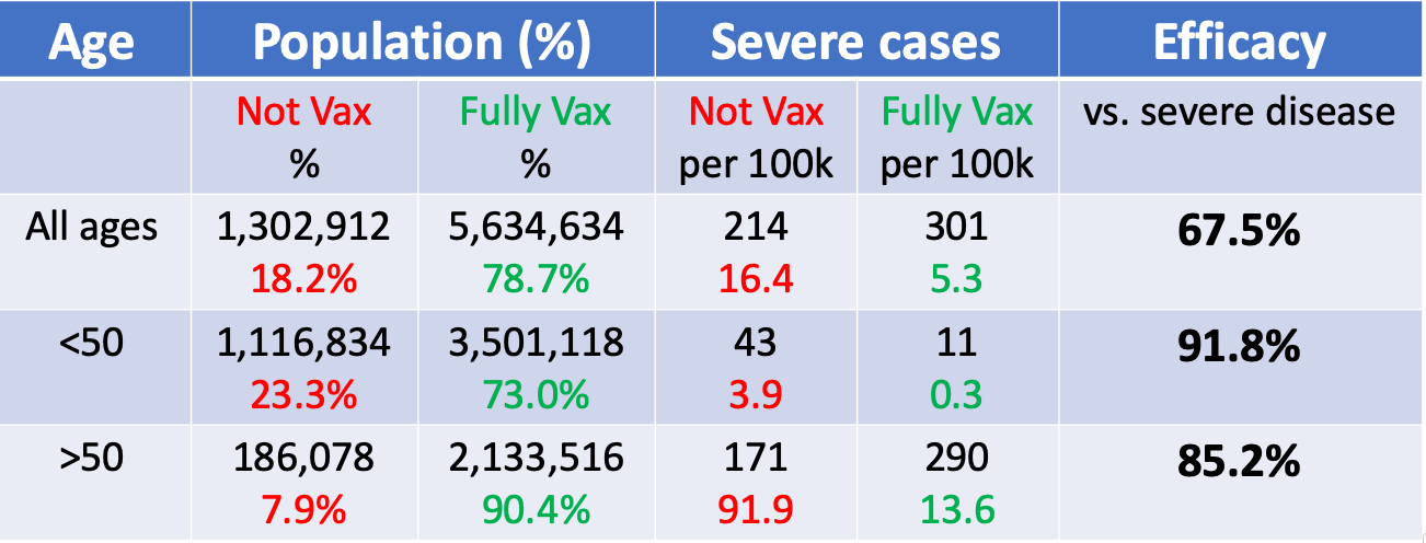
You may remember some viral news stories about a month ago stating that COVID vaccines were proving to be less than 70% effective in Israel. But given what you learned so far, would it surprise you to learn that this same data also showed the vaccines were over 85% effective for people over 50, and nearly 92% effective for people under 50 years old?
Of course it would! Paradoxes are weird and wild things. I’ve recalculated the math above a half-dozen times, still worried that I’m missing something.
What’s happening here is that older people are much more likely to suffer severe cases of COVID than their younger counterparts, whether vaccinated (.290% vs .011%) and unvaccinated (.171% vs .043%).
And because nearly 92% of people over 50 in the data set were vaccinated while only 76% of those under 50 were, the fully vaccinated number has a much higher representation of older people. In other words, high-risk patients make up 37.8% of the vaccinated group and only 14.3% of the unvaccinated group. Because we’ve moved a much larger percentage of high-risk patients into the vaccinated group, it skews the aggregate numbers away from each sub-group’s performance.
This is why scientific vaccine trials work so hard to ensure the test and control groups are representative of the overall population. And why I think it’s so important to understand how statistics work.
Not just in the sense of how you can calculate some numbers in a spreadsheet, but being able to really get down to the impact of a policy, product, or message. (RJA)
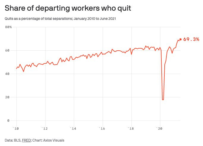
Chart of the Day:
People are quitting their jobs at a record rate. Myself included. Go find something you love doing! (RJA)
Quick Links:
Base Rates are at the heart of many statistical paradoxes and are a worthy topic of exploration on their own. (RJA)
The Washington Post recently put out an amazing profile of Christopher Lloyd. (RJA)
The man trying to stop $45 billion of organized theft from CVS. (RJA)
__
WITI x McKinsey:
An ongoing partnership where we highlight interesting McKinsey research, writing, and data.

The delicious Thai food you ordered is part of a bigger economic story. App happy eaters are part of a growing global market for food delivery—which interestingly now registers at $150 billion, more than triple its 2017 value. See how your small order fits into the bigger picture with a new article on the trends and opportunities in this fast-growing market.
__
Thanks for reading,
Noah (NRB) & Colin (CJN) & Ryan (RJA)
Why is this interesting? is a daily email from Noah Brier & Colin Nagy (and friends!) about interesting things. If you’ve enjoyed this edition, please consider forwarding it to a friend. If you’re reading it for the first time, consider subscribing (it’s free!).