Rex Sorgatz | October 19, 2021
The Key Art Edition
On streaming, promotions, and the artistry of getting people to watch tv
Recommended Products
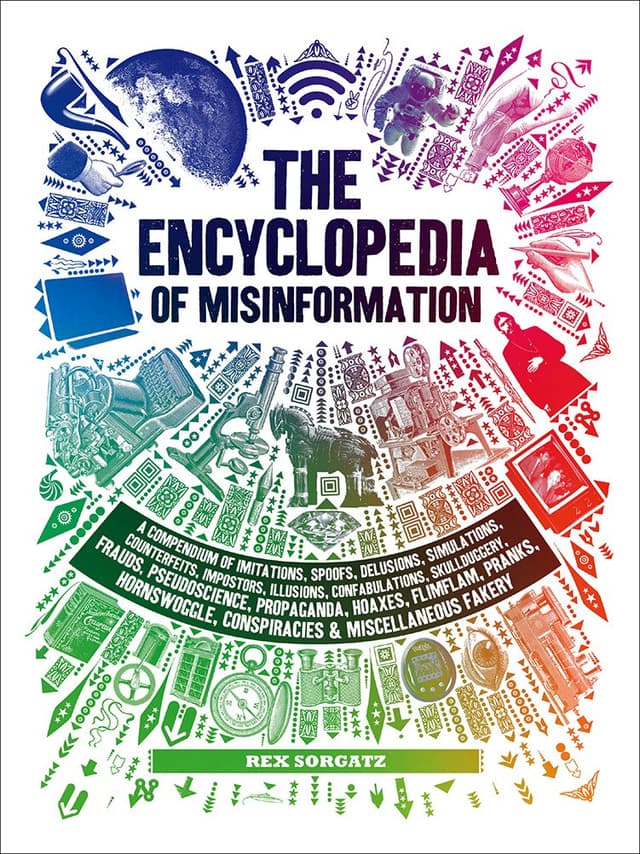
A comprehensive encyclopaedia that explores a wide range of topics related to misinformation, including counterfeits, confabulations, and various miscellaneous subjects.
Rex Sorgatz (RS) wears a lot of hats. He’s one part media theorist, one part cultural observer, and one part creative technologist. He wrote an actual Encyclopedia of Misinformation and has been a longtime fixture in the most interesting NYC circles. He previously covered deepfakes for WITI in the Eternal Celebrity Edition.
Rex here. I remember when I first noticed it. Maybe you noticed it too, around the same time. Something was changing.

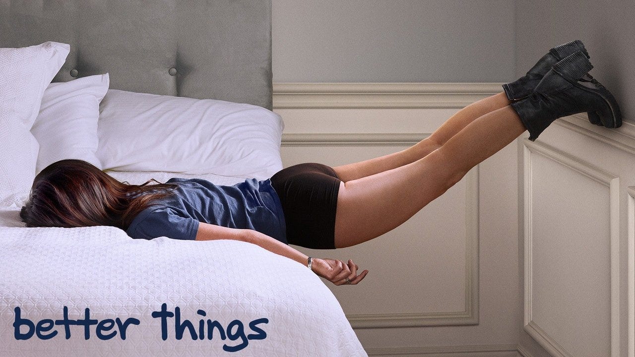
For the first time ever, an image was so evocative, so mysterious, so persuasive, that it alone beckoned me to watch a TV show.
It seemed a fluke. But then it happened again, not long after:
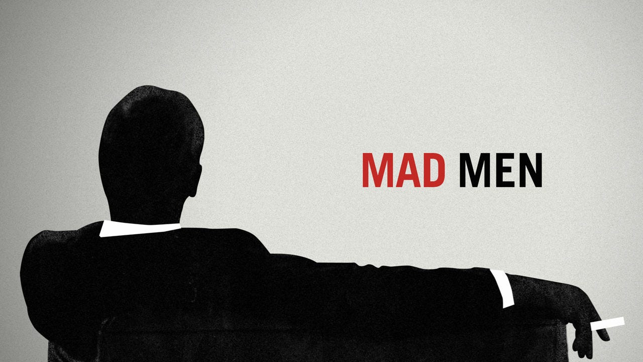
Now, it happens all the time.

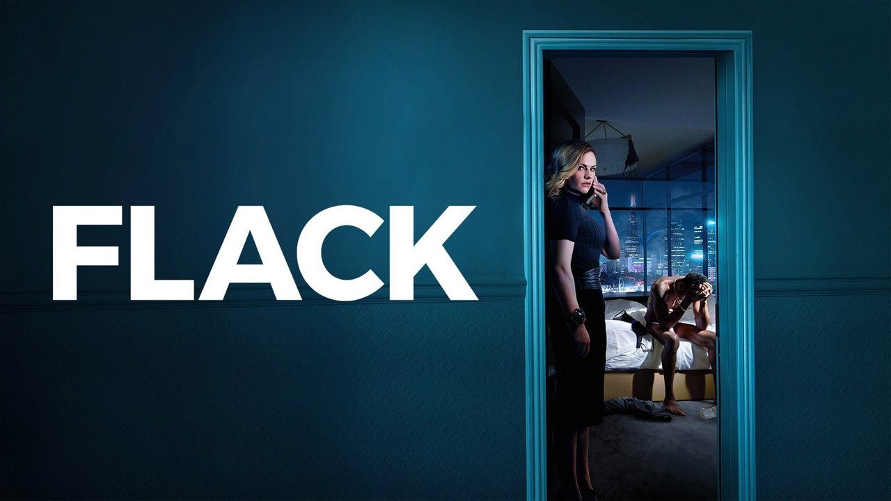
What magnificent images. Each is a real vibe. Don’t you want to tap on every single one? Knock-knock, can I please enter your world?
There’s an industry term for these types of images, and I feel no embarrassment defining it, because the term is obscure enough to not yet warrant a Wikipedia entry. But if you are an art director or a TV producer, you know good key art when you see it. And lately, you see a lot of it.
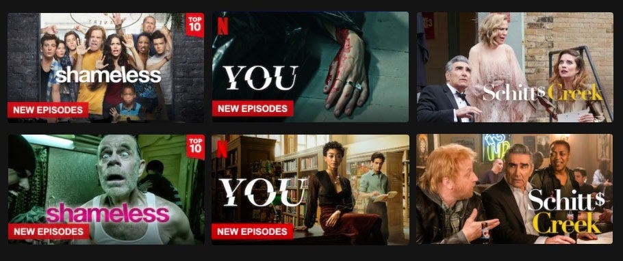
Among its unique properties, key art always appears in competition with other key art. Go head, open your favorite streaming service, and you’ll see rows of key art, neatly regimented in grid formation. Here’s the top of my Hulu right now:
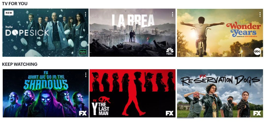
Such a tantalizing spread! They remind me of sampuru, the intricate food replicas seen in the windows of Japanese restaurants. Like a hyperreal menu, designed to get the mouth watering, they have developed into a unique art form unto themselves.
Good key art is elegantly efficient. It communicates so much so quickly. At a glance, you instantly know the universe within, like a pin in the map declaring YOU ARE HERE.

I have never seen Intervention, but please please, let me visit, briefly, your suburb ensconced in a syringe.
Netflix has produced research saying our eyes can only focus on key art for 1.8 seconds. Honestly, that seems high? Who knows, but I’ve gazed at this Sneaky Pete image far longer than I’ve ever contemplated Starry Night.
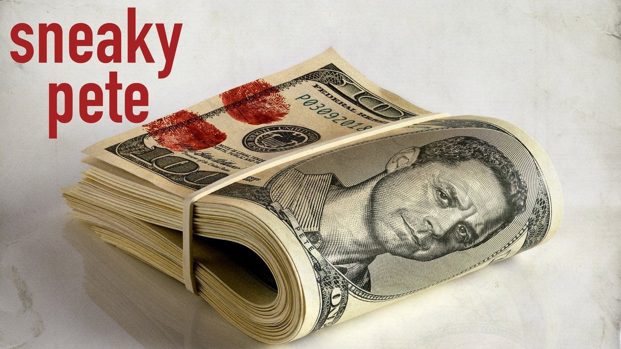
Forget Beeple, please award $69 million to whoever made this, and throw in an Emmy:
Uh-oh. Who hasn’t been there?
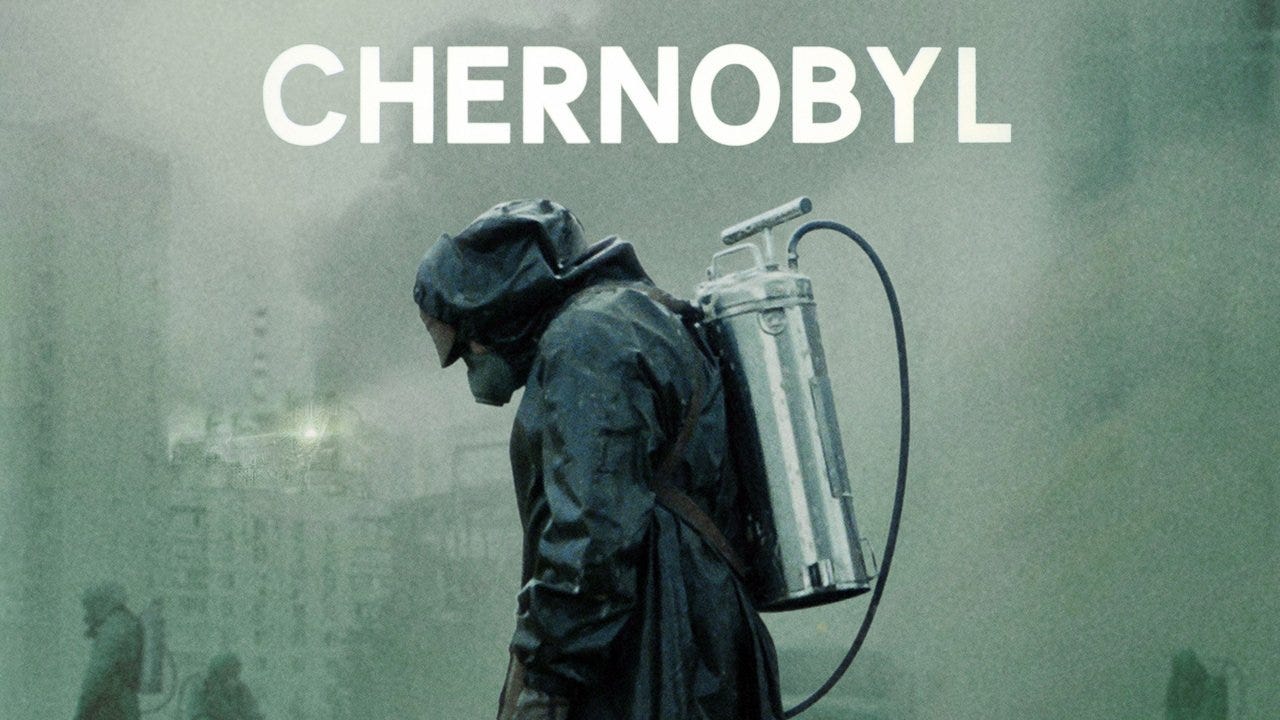
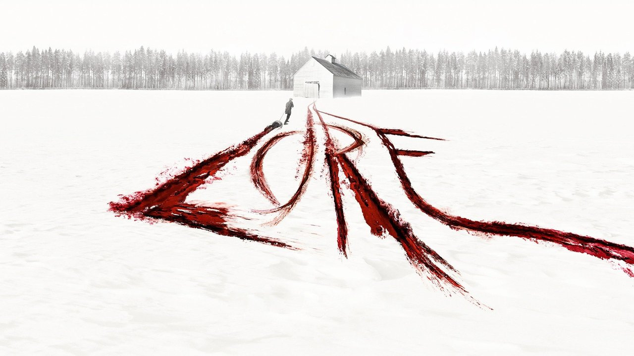
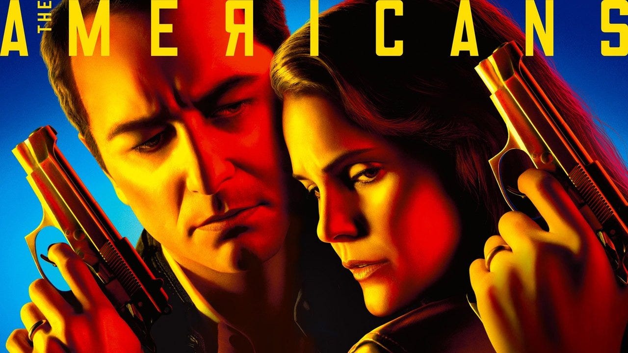
Good key art is so evocative, so iconic, that it becomes the image that springs to mind whenever you think about a show:
One neglected characteristic ties all these images together: They are all horizontal.
It sounds trivial, but going wide helped differentiate TV key art as its own medium, distinct from book covers and movie posters. And because these images appear on streaming platforms, they are unencumbered by other marketing copy, like taglines, cast and credits, and multifarious blurbs.
There is a simple purity to key art.
Who would dare call that a “video thumbnail”?
Now, every network, HBO to HGTV, produces standardized key art, always at the same 16:9 ratio. Each image contains a stark photo plus an imaginative typeface—that’s it. Those are the only rules. But rules make things interesting.
Why is this interesting?
I have a theory! (Why else would you be here?) I believe key art started becoming irresistibly good around the same time as another emergent media innovation—image macros.
Macros are the wildly popular subset of internet memes, the ones with text superimposed on images. You know them when you see them, and when you see them, you see them everywhere.
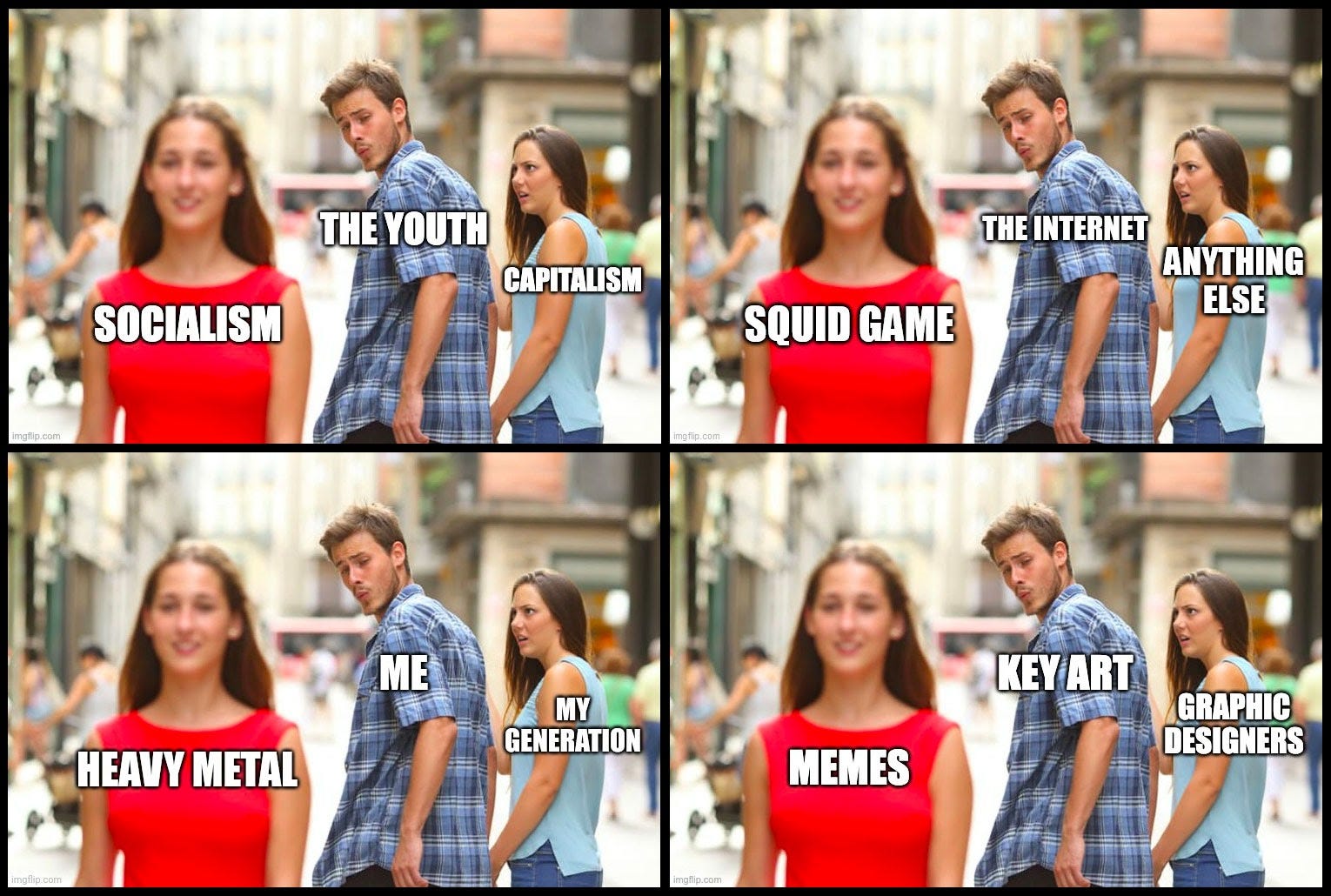
Key art functions similarly, binding text and image together in an intricate visual-linguistic dance. It works like math, or perhaps chemistry.
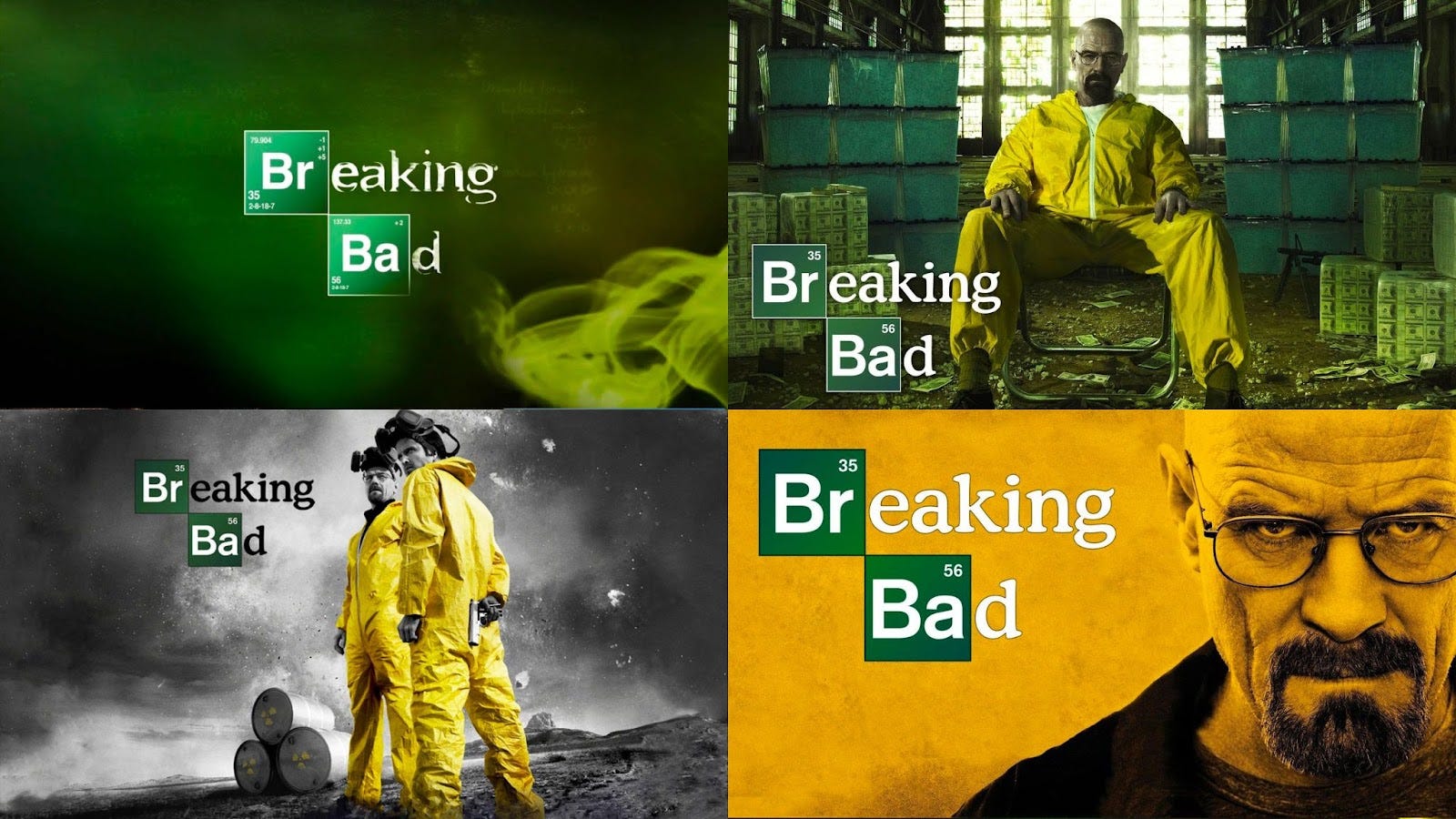
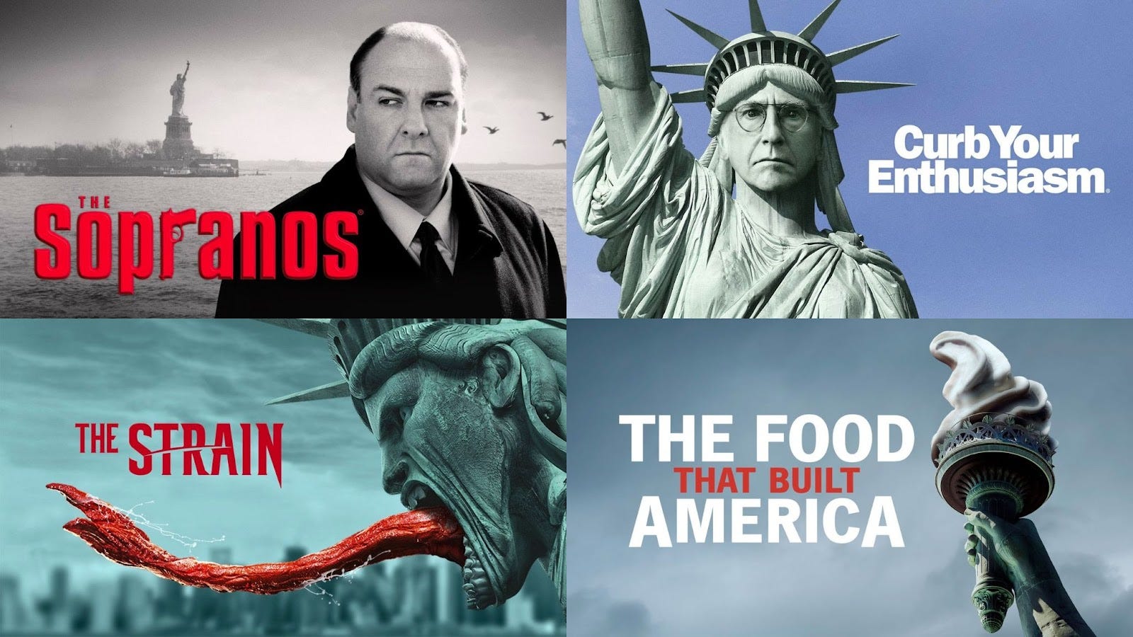
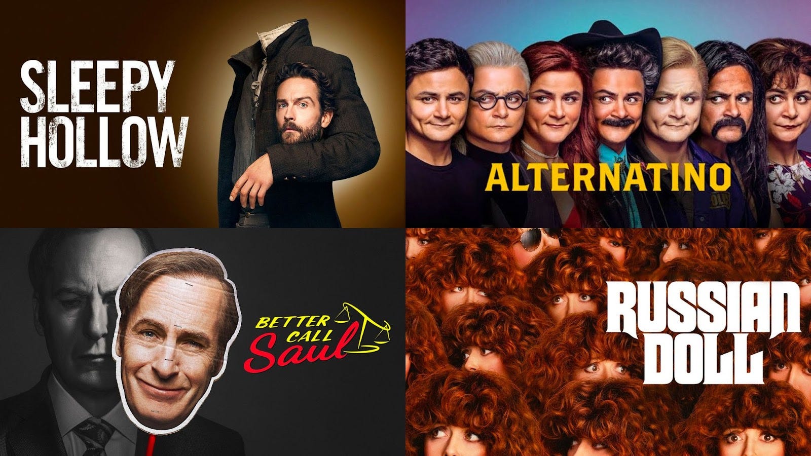
With both memes and key art, you just instantly get it. And like memes, key art also has its own form of remix. Find the pattern, and then iterate:
Netflix research has shown that faces are a critical aspect of successful key art vocabulary, and so deconstructing the visage has become a popular technique:
Unfortunately, the world’s largest streaming company also hates key art.
I exaggerate. But let’s not mince words, Netflix is determined to drain the creativity out of this emerging medium. It all started in a 2017 blog post, where the streaming company revealed that it was tailoring key art to individual users:
Given the enormous diversity in taste and preferences, wouldn’t it be better if we could find the best artwork for each of our members to highlight the aspects of a title that are specifically relevant to them?
Hang on, I got this one.... No!
On Netflix, each user now sees different key art, based on their user activities and ultimately their demographics. Which helps explain why you and your partner can never agree about what to watch. You are literally presented with different options.
To illustrate, I loaded up my wife’s Netflix profile next to mine. We got some of the same recommendations, but the artwork makes the shows look completely different:
Worse than being different, the images are also just atrociously bad. That’s because Netflix uses algorithms to extract screenshots from the video, and then puts them in competition with other screenshots of the same show. The images don’t accurately represent the show; they merely outperform their competitors. Over time, this makes Netflix key art less iconic, less interesting. Instead of nurturing a vibrant art form, Netflix produces mere thumbnails—that related genre of imagery generated by the borg known as YouTube.
In the midst of a golden age, Netflix is A/B testing their way to mediocrity.
Which is upsetting, because logging into a streaming service already feels vaguely oppressive. You are immediately faced with stacks of options, each demanding 1.8 seconds of your attention. It’s the quintessential paradox of choice. But key art—good key art — can be a buffer against mechanization. It represents hope for the individual in the face of uniformity. It is the quintessential art form to thwart the algorithmic age.
Knock-knock, please let me into your world. (RS)
Quick Links:
I am legit fascinated with this medium — so much so that I maintain a gallery of My Own Personal Favorite Key Art. Did I miss your favorite? If so, email me! (RS)
In addition to the arresting Lost marketing campaign, another turning point in the key art revolution was Annie Leibovitz’s photo shoot for The Sopranos. (RS)
Who are the designers behind all this work? I asked around. Some networks use their own internal marketing team, while others outsource campaigns to creative studios that specialize in this craft. Those include IconArts, Arsonal, and The Refinery. (RS)
Want to learn more about Netflix’s atrocities to key art? Here’s a Vox explainer. (RS)
Are Bayesian probabilities your jam? Here’s a 46-minute presentation about algorithmic image personalization [pdf] from a Netflix data engineer. The engineer concludes that future algorithms could personalize other aspects, including the synopsis, the trailer... and eventually the content itself? (He doesn’t say “the content itself,” but it makes you wonder!) (RS)
A note on vernacular. Technically speaking, “key art,” like “cover art,” started as a generic term for a wide variety of marketing materials. But in recent years, TV has championed it as their own. Which is why, despite the lack of wikipedia’s imprimatur, there is an entry for the Key Art Awards, which were once awarded by Hollywood Reporter, but have since been absorbed into the Clios. (RS)
While researching this topic, I found a job posting for a Key Art Designer at Netflix. Tempting, right? If you are a designer reading this, please consider applying. You alone could be our last hope to subvert the future from banal thumbnails. Save us from our dreaded algorithmic fate! (RS)
--
WITI x McKinsey:
An ongoing partnership where we highlight interesting McKinsey research, writing, and data.

A life in full. Indra Nooyi, former chairman and CEO of PepsiCo, is a trailblazer—she was the first woman of color and immigrant to run a Fortune 50 company. But how'd she manage a demanding career and a growing family, and what did she learn along the way? Find out in a can't-miss interview from McKinsey's Author Talks series.
--
Thanks for reading,
Noah (NRB) & Colin (CJN) & Rex (RS)
—
Why is this interesting? is a daily email from Noah Brier & Colin Nagy (and friends!) about interesting things. If you’ve enjoyed this edition, please consider forwarding it to a friend. If you’re reading it for the first time, consider subscribing.