Colin Nagy | July 13, 2021
Decoding the Friendly Skies Edition
On United, advertising, and strategy
This is one of my favorite WITI contributions. Re-running it today. -Colin (CJN)
Colin here. We recently spoke to a few United flight attendants (part one and part two) that recounted their amazing histories in the skies. One of them, Gloria, has flown for the airline for 52 years. Her career is an interesting lens to view changes and progress in America during that time.
Also interesting to me as a brand-obsessive is how United Airlines, who have been vilified over the last few years, communicated through the ages. Gloria’s incredible history prompted me to dig into the archives and decades of brand culture and communication.
I had a relationship with United as a child (my dad was a United 1K frequent flyer), I can remember being allowed in the Red Carpet Club (their lounge at the time) on our very best behavior. Living in one of their hub cities, San Francisco, the brand had an outsized role in my life and perspective on travel. So it was interesting to see the breadth and depth of the creative work for the airline, before I started flying, the stuff that resonated with me as a child and a young flier, and the way the brand progressed through time and different eras.
Why is this interesting?
We tend to think that everything today is more sophisticated—that technology solves all business problems and advertising has made step-changes over the decades. This is sometimes true. But as I looked back through the communications (some good, some dreadfully outdated), I saw a strong underlying business strategy, brand, and poetic use of emotion. Some of the work, most done by Leo Burnett in Chicago, was brilliant, innovative, and a growth driver for the airline.
Here’s a look at what I uncovered with a bit of commentary.
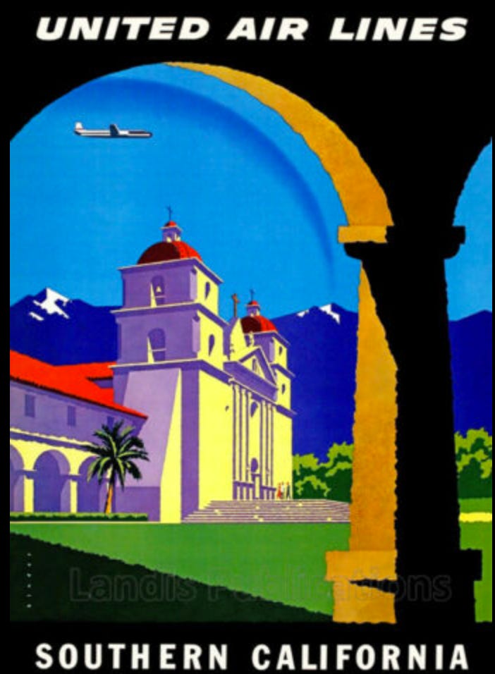
1950’s:
The 1950’s advertising truly feels like a different era. It was focused mostly on building the case for cross-country business travel. The airline marketed certain flights like the “Chicago Executive” as men-only, advertising a club-like atmosphere where you can smoke your pipe. This is obviously of a different age and has an early-Mad Men chauvinistic feel. Also noticeable is the beginning of the destination branding: highlighting the exotic locations the airlines can take you.
1960’s:
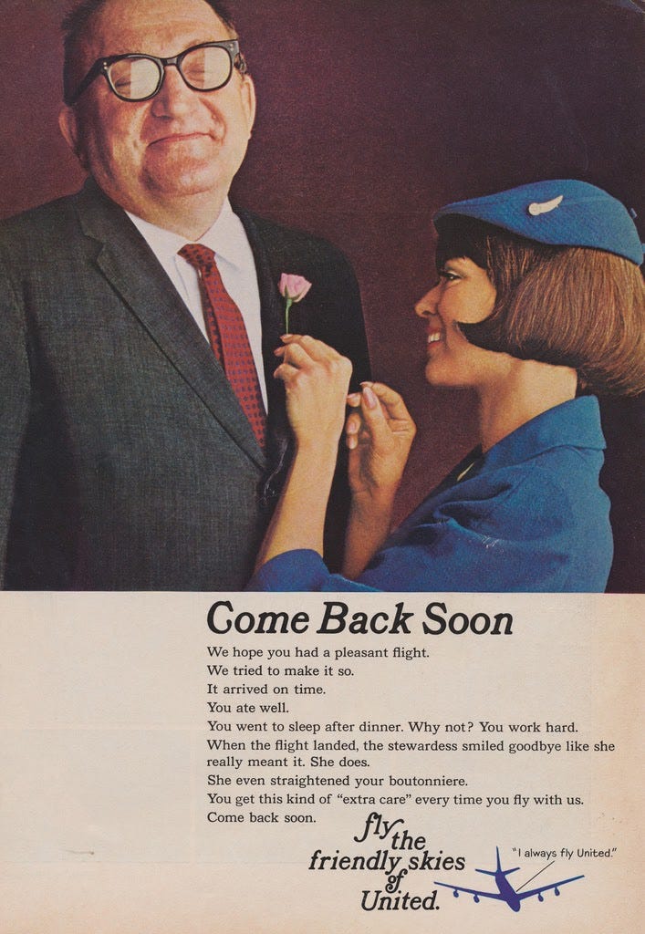
The University of Chicago magazine did a great write-up of the initial strategy that lead to the iconic “Fly the Friendly Skies” line, launched by Leo Burnett:
In 1960, United was the General Motors of air travel—“professional, official-looking” and “a little stuffy and cold—coldly efficient, with a production-line attitude.”
William Patterson, United’s president since its beginnings in 1934, prided himself on the airline’s hard-won reputation for reliability, but he knew that United desperately needed to sell more seats. He also knew that a stodgy image was a death knell for a corporation—after all, this was the 1960s, when youth culture ruled the American cultural landscape. The trouble with United’s image, according to Burnett’s team, was its lack of “friendliness, warmth and humanness and ... fun.”
The advertising of this era was copy-heavy, and focusing mostly on competitive differentiation. It’s interesting how quickly the industry moved from the basics of air travel (where it goes, how it works), to the benefits on how it will make you feel.
1970’s
In the 1970s, United tried to continue to capture the zeitgeist while also fending off competition for it’s key business traveler routes. Notably, this is also a period when they tried to expand their base encouraging business travelers to “take someone along”. Given the economic situation in the United States in the 1970s, it’s not a huge surprise that the airline was trying to double the dollars from their existing customers.
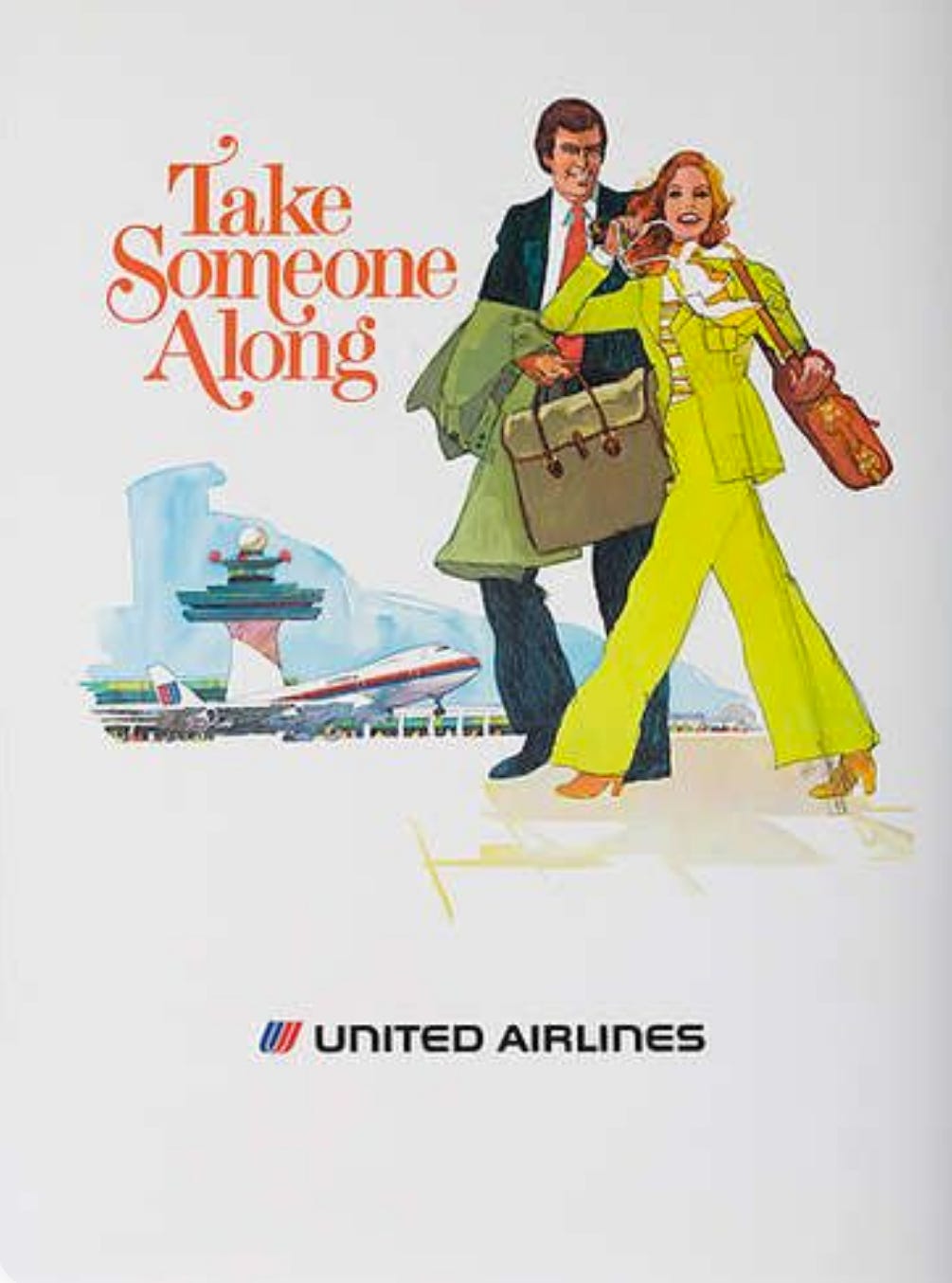
Also, empathy was front and center in the spots of this era, focusing on treating customers right. A far cry from the reputation of United today.
Here’s an example on Youtube (direct link to video)
1980’s
United started to use music in an iconic way, licensing Gershwin’s Rhapsody in Blue (for $300,000 per year). The use of the track, in my opinion, transcended its original composition and was forever intertwined with the airline. It is one of the strongest examples of sonic branding in advertising history and created a worldly, elegant, and slightly whimsical element to the brand. As a child that flew a lot of United out of SFO in the 1980s, this song is forever imprinted in my memory. (direct link to song)
They even had some fun with the brand territory they created and made iconic. The late 80’s saw advertising reinforcing the reliability and safety of the airline, highlighting demanding mechanics arguing and saying, “there’s a place at United Airlines where not everyone is so friendly,” hinting at the rigor that went into flight safety and mechanical engineering. (direct link to video)
1990’s
The 90’s advertising hinted at the power of human connection, an early play to fend off the dual threat of email and conference calls. As my brother pointed out when he originally shared the spot, this could definitely get a reboot today post COVID. Also, Gene Hackman’s narration adds a slightly gruff, authoritative tone to everything. (direct link to video)
This film from 1992 touting the airline’s transpacific service was a huge creative leap for the brand. It featured impressive cinematic tricks for its time (Orcas in the cabin) that ultimately make an old point about space and comfort in a slightly more subtle way (link to video).
2000’s-Present
Unfortunately, the last twenty years haven’t featured quite as much creativity as were on tap in the decades prior. In 2013, United tried to reboot its friendly skies campaign, using the “____, friendly” construct. While attempting to return to one of their most memorable campaigns makes perfect sense, it’s hard not to feel like this attempt to turn it into an advertising-by-numbers framework sucks most of the emotion out of the idea. What started in the 1960s as an attempt to make the brand feel more “friendliness, warmth and humanness” is sadly lost in this campaign that feels like it could just as easily be for a consulting firm as one of the world’s most iconic airlines.
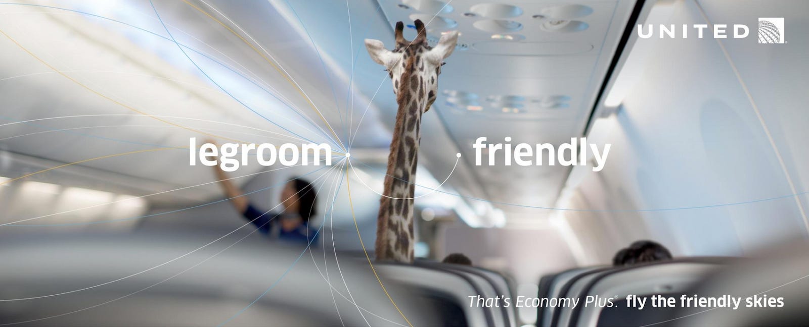
Creatively, it seems as if they are back where they were in the 1960’s pre Leo Burnett. The marketing is cold, rational, and lacking any of the soul and spirit that was coaxed out of the brand in the following decades. While air travel has become a commodity and gets people cheaply from point A to point B, maybe post-pandemic, as people are evaluating what travel means to them, some wonder or soul can be re-implanted back into the brand by tapping into this storied and interesting heritage. (CJN)
Thanks for reading,
Noah (NRB) & Colin (CJN)
—
Why is this interesting? is a daily email from Noah Brier & Colin Nagy (and friends!) about interesting things. If you’ve enjoyed this edition, please consider forwarding it to a friend. If you’re reading it for the first time, consider subscribing (it’s free!).